Software
Although other software can be used, PowerPoint is highly recommended.
Why PowerPoint? PowerPoint is widely available and familiar to most users.
Templates
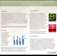
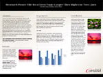
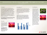
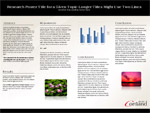
Using a pre-made PowerPoint document/template helps ensure that your poster gets off to the right start and can speed up production and eliminate questions regarding setup. A variety of templates are available with different dimensions below.
Please note that you will need the two official college fonts. To download the fonts, login to myRedDragon and choose the Tech Help tab, and find the SUNY Cortland Fonts under Popular Links. Select the appropriate link, download and install. NOTE: if you're having difficulty with the font installer, please contact The Help Center (Email: THC@Cortland.edu) for support.
Not using a template? Here is some basic information to help setup your PowerPoint document.
When preparing a poster in PowerPoint the first thing that needs to be done is to resize the dimensions of the document. To set the size of the poster use page setup. Please note that the maximum height and width that Powerpoint allows is 56 inches. Additionally, any one dimension (height or width) cannot exceed 42 inches as that is the maximum width that the printer is capable of producing.
Here are some common/suggested poster dimensions: 40"X30", 48"X36", 56"X42"
You are encouraged to include the SUNY Cortland logo on you poster; a variety of useful formats are available in the SUNY Cortland Brand Identity Templates page.
Layout and Design - Images
The key to a good poster is to stay on subject and keep your message simple and clear. Limit your poster to simple colors and special effects; less is more and white space isn’t always a bad thing.
Before using an image or photo make sure that you have the proper copyright or creative commons permissions to use them AND cite all sources.
A major key to designing your poster is consistency. Fonts, font sizes and colors should be limited and uniform. SUNY Cortland has outlined official campus fonts and colors that are recommended for use. The campus fonts are Americana and Agenda.
As a general rule all text should be readable from a distance of three feet away. Therefore it is recommended that your main body copy be at least 25pt type and your subtitles 50-75pt. Remember to make your message concise as text heavy posters can turn viewers away. Use visual aides such as charts, diagrams or photos to break up text and enhance your poster.
When using images and photographs make sure that they are high enough in resolution (print quality is 300dpi or better) in order to look good at large print sizes. Most images/photos from the Web are not high enough quality or resolution to use for a printed poster. If you are unsure if your images are high enough quality to print, please inquire with Contact Print Services.
Tip: when resizing images hold down the shift key in order to maintain the height to width ratio of an image.
Note: PowerPoint cannot wrap text around images like MS Word.
